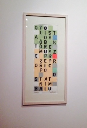
Last weekend we stopped in at our local Modern Art Museum for a special exhibition of Polish artists. I can never understand why were are literally the only people in the entire museum—after all, the exhibits are usually pretty interesting, the entrance fee is crazily low ($5.00 for a family ticket) and the museum is right in the middle of a popular park with a well-attended church right next door. But then, I also can’t figure out why the coat-check guy has a gun in his holster, either.
At any rate, it’s never crowded. 🙂
The current special exhibit included photography, painting, sculpture (Anna sat in front of a fiberglass statue of a girl with a heart-shaped head for ages) and mixed-media. I was in the mood to be inspired with color and application, and this painting by Paweł Susid caught my attention. I love the colors, I love how it’s laid out in a narrow vertical format, and I love the use of alphabet stencils. I don’t know what it says—or indeed, if it says anything specific, but that’s sort of beside the point. The balance, the squares, the idea of replicating the basic format on a card or art journal page really captured my attention.
And of course, I love discovering artists who love playing with words and letters. I think Paweł Susid has a new fan in me.
Here’s to artistic discoveries!
Happy Friday!
It’s a windy, gray day here in the California bay area and a great day to visit a museum.