This week I’ve been working on cards for the July issue of Stamp & Scrap Arts—and loving the citrus colors and the thought of warm sunshine in the midst of a very cold winter day. As I worked, I thought about card layout designs and wanted to share the story of my card layout “rut” with you.

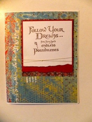
This is a card I made for my niece’s birthday. It’s nice and I like it, but I realized that the layout is one I use so often it’s like a default design! Most of my cards have a stamped focal that’s matted and wrapped with ribbon or embroidery thread, then placed onto a card front that’s decorated with patterned paper. It’s stamp, mat, wrap, glue…and while I like the layout (obviously!) I realized I needed to be a bit more conscious of my design before going on auto-pilot.

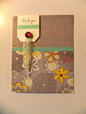
So here’s another card I made as a thank-you note. Resisting the urge to stamp, layer, wrap and glue, I closed my eyes, opened a recent issue of The Stamper’s Sampler, and put my finger down on a card. Then I copied the card layout…somewhat. The elements that designer had used were very different than what I had on hand, so I had to adapt somewhat but the basic idea is the same.
In the end, I was pleased with both card designs…and while I find myself creeping back to my old standard layout (especially when I’m busy or working quickly) I’ve also got this idea in my head of trying something different—and it could be as simple as opening a magazine page at random, and trying to copy the layout!
Happy Wednesday!
